
Two-Tone Paint Color Combinations for Renters
Six tested two-tone paint pairings with real color codes, how much paint you need per wall, and how to test samples honestly before committing in a rental.

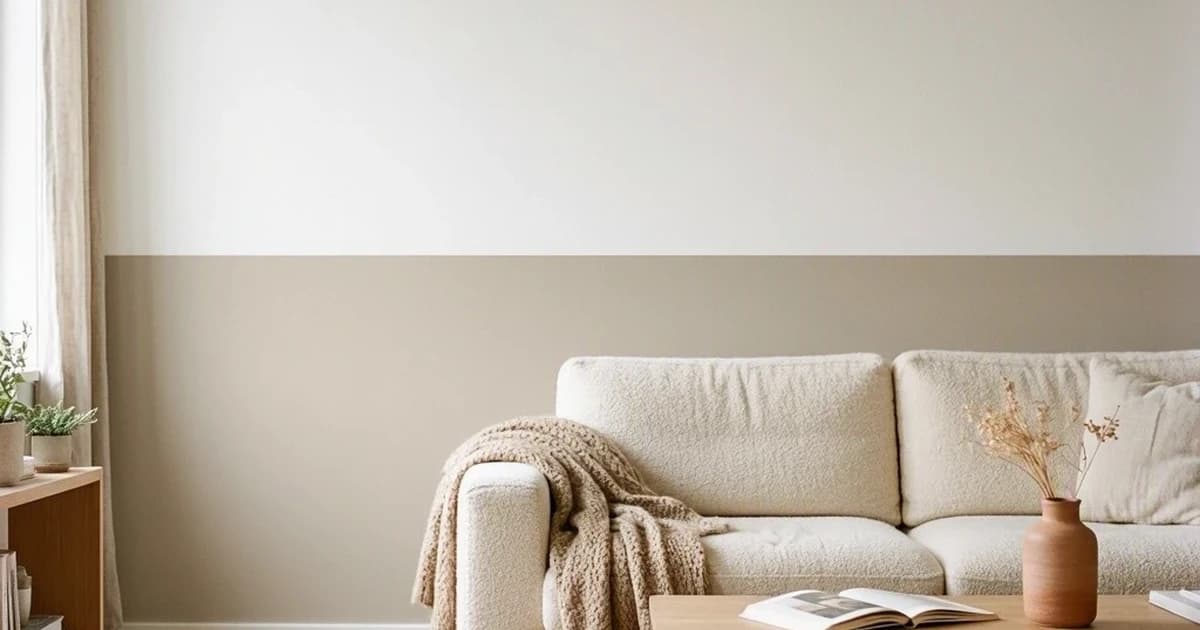
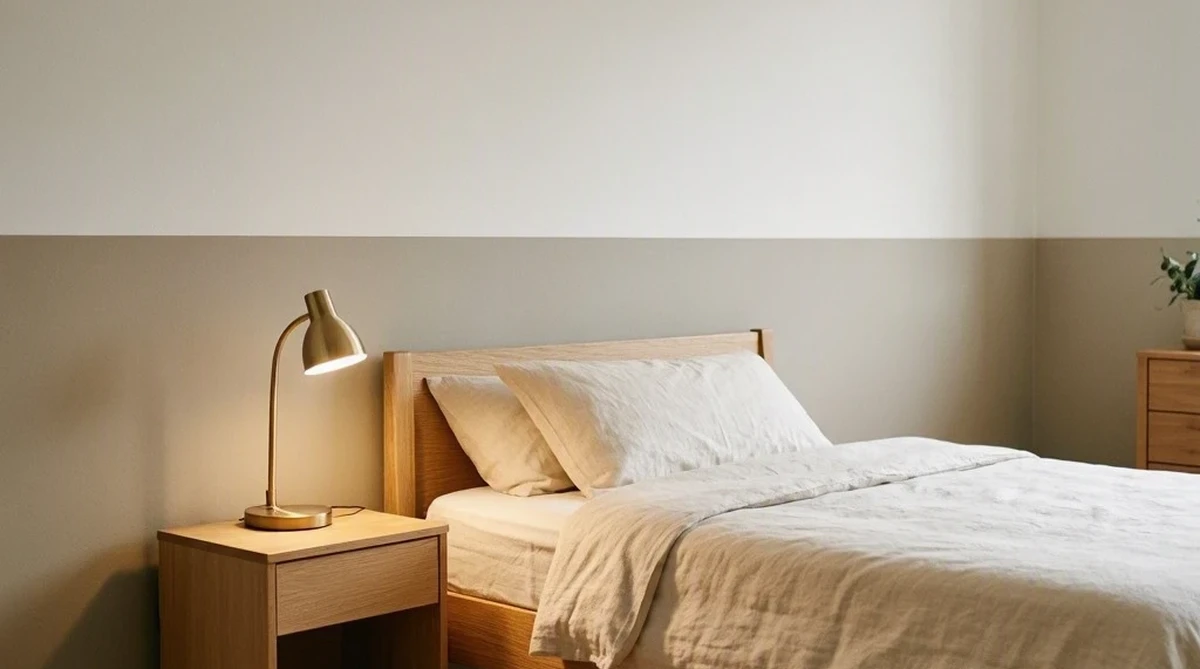
Pair a light neutral with one deeper tone from the same undertone family, put the darker color low on the wall, and a small rental reads calmer and taller instead of busier.
Jump to:
- Why undertones matter more than the colors themselves
- Six two-tone combinations that work in a rental
- How to test before you commit to a gallon
- How much paint you actually need
- What renters can and cannot do
- Mistakes that make a pairing fall apart
- FAQs
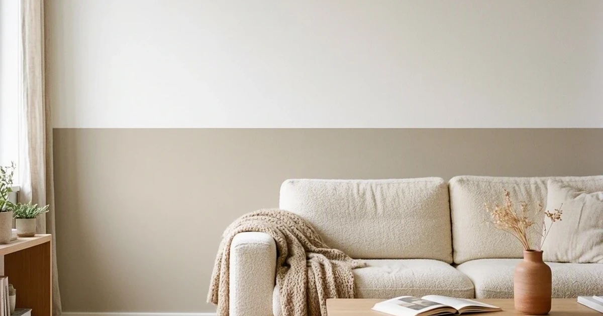
Most two-tone paint jobs fail for the same reason: two colors that look fine on their own but were never checked against each other in the room's actual light. This guide skips straight to combinations that already survived that test.
Why undertones matter more than the colors themselves
A good two-tone pairing shares an undertone family. Warm with warm, cool with cool. A creamy white and a warm greige sit together without friction because they're pulling from the same base.
Mix a warm, yellow-leaning white with a cool blue-gray and both colors start to look slightly off, like something is wrong with the room rather than the paint. Neither color is the problem on its own. The mismatch is.
Contrast level matters too, but less than undertone. Enough difference between the two tones that they read as a deliberate choice, not so much that the room feels chopped in half. In a small rental, confine the strongest contrast to one wall or one zone and let the rest of the room stay quiet.
Six two-tone combinations that work in a rental
1. Chantilly Lace OC-65 + Revere Pewter HC-172. Crisp white above, warm greige below. The most forgiving pairing here, works in almost any light and doesn't fight existing wood tones. Good default if you're unsure where to start.
2. Sea Salt SW 6204 + Alabaster SW 7008. A muted blue-green low, warm soft white up top. Reads spa-calm rather than cold, since Sea Salt still carries enough warmth to avoid feeling clinical.
3. Agreeable Gray SW 7029 + Pure White SW 7005. The most "designer neutral" of the six. Agreeable Gray avoids the green or purple cast that some greiges pick up in mixed light, which is why it stays popular across very different rooms.
4. Repose Gray SW 7015 + Naval SW 6244. The one bold option here. Naval is a genuinely deep navy, so keep it to one wall or the lower third only. Works well behind a desk or sofa where you want a defined, cozy zone rather than an all-over color statement.
5. Palladian Blue HC-144 + Chantilly Lace OC-65. Light aqua below a bright white ceiling and upper wall. Slightly vintage, slightly coastal, and one of the few blues I'd actually trust in a room that doesn't get much sun.
6. Hunter Green 2041-10 + Cloud White OC-130. The riskiest pairing on this list, and only worth it in a room with strong natural light. Confine Hunter Green to a single accent wall. Everything else stays Cloud White so the depth reads as intentional rather than closing the room in.
For the specific mechanics of where to place the line between two colors, the two-tone wall paint guide covers exact split heights by ceiling height, and the bedroom accent wall guide adapts the same technique specifically for a headboard wall.
How to test before you commit to a gallon
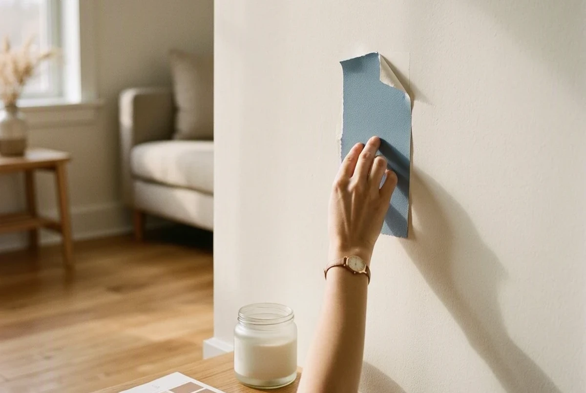
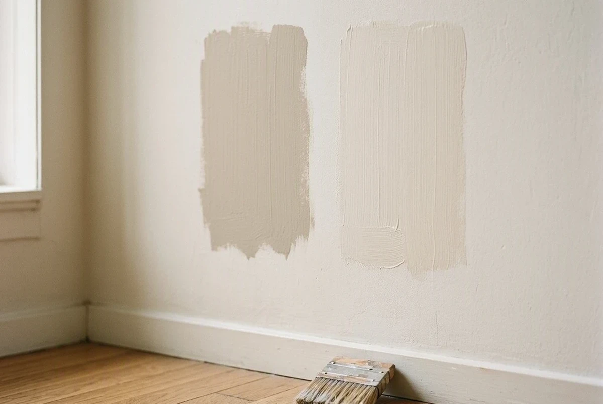
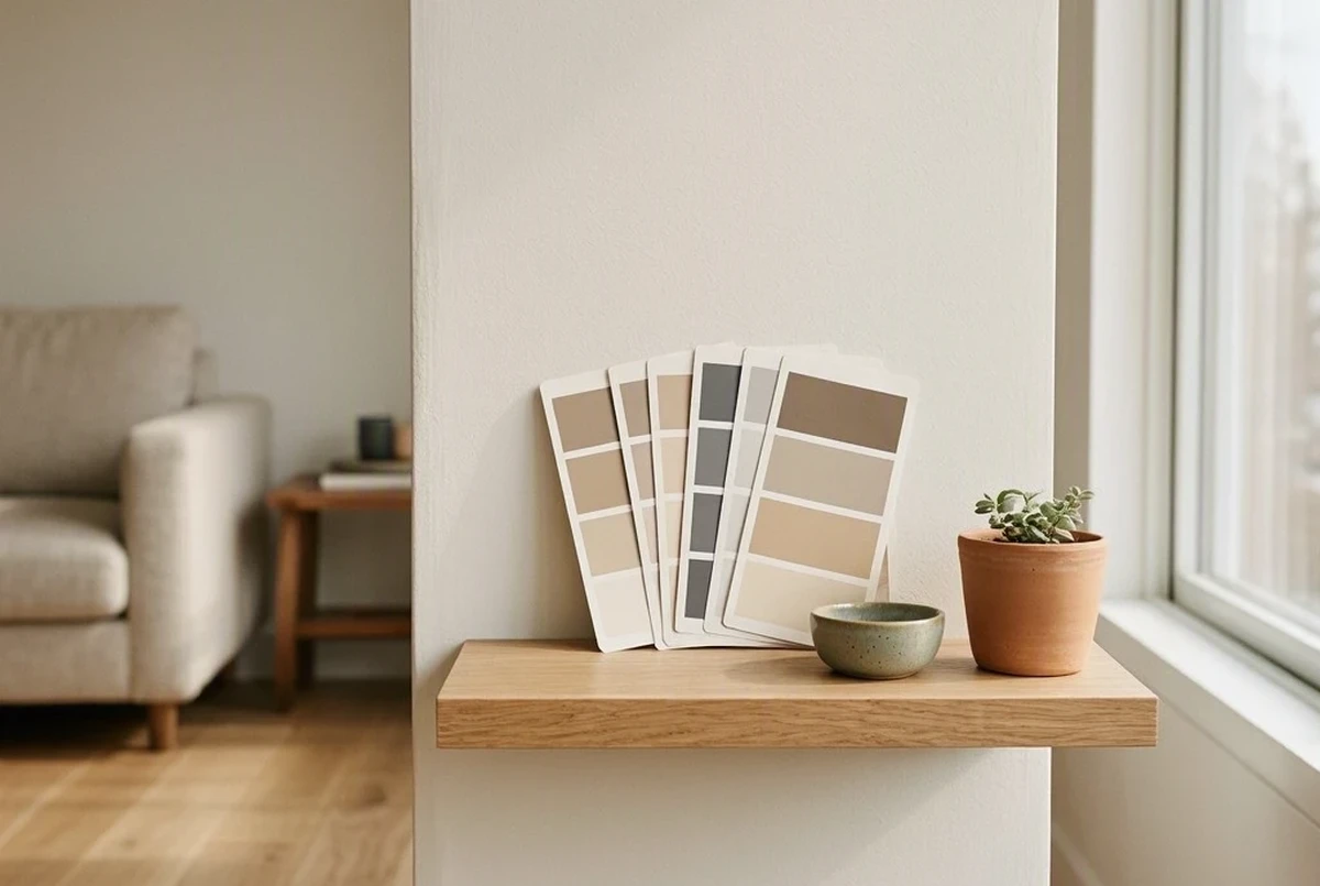
Paint chips are useful for narrowing ten colors down to three. They're too small to tell you anything reliable beyond that. Wall color shifts with the room's actual light, the sheen you pick, and whatever finishes sit next to it.
Benjamin Moore's 8 oz color samples run $5.99 and brush onto roughly a 2-foot by 2-foot area, enough to judge a color honestly. Peel-and-stick swatches from Samplize cost about $6.95 at 9 by 14.75 inches and move between walls without any mess, which matters more in a rental than anywhere else.
Test three to five colors from the same undertone family, on the actual wall, at morning, afternoon, and evening light. Fewer than three risks missing a better option. More than five just slows down a decision that the light will settle for you anyway.
Hold the sample next to your flooring and trim too, not just against a blank patch of wall. A color that looks neutral in isolation can turn distinctly warm or cool once it sits beside a wood floor with its own undertone.
How much paint you actually need
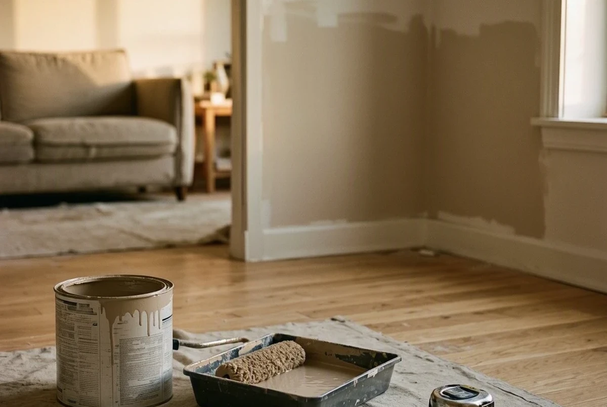
Interior paint covers roughly 350 to 400 square feet per gallon. A single accent wall in a 10-by-12 room with an 8-foot ceiling runs about 80 square feet before subtracting a door or window, which puts it well under one gallon even with two coats.
Buy the full gallon anyway. The margin covers a second coat and any touch-ups later, and half-used cans of a discontinued tint are a real problem if you need more in six months.
A lower-third treatment across an entire room needs less paint but more math. On an 8-foot wall, the lower third runs about 32 inches high, and across a typical room's perimeter that's roughly 100 to 120 square feet before openings. A quart can cover that, but a gallon still gives room to fix drips or extend the line if you change your mind on the height.
What renters can and cannot do
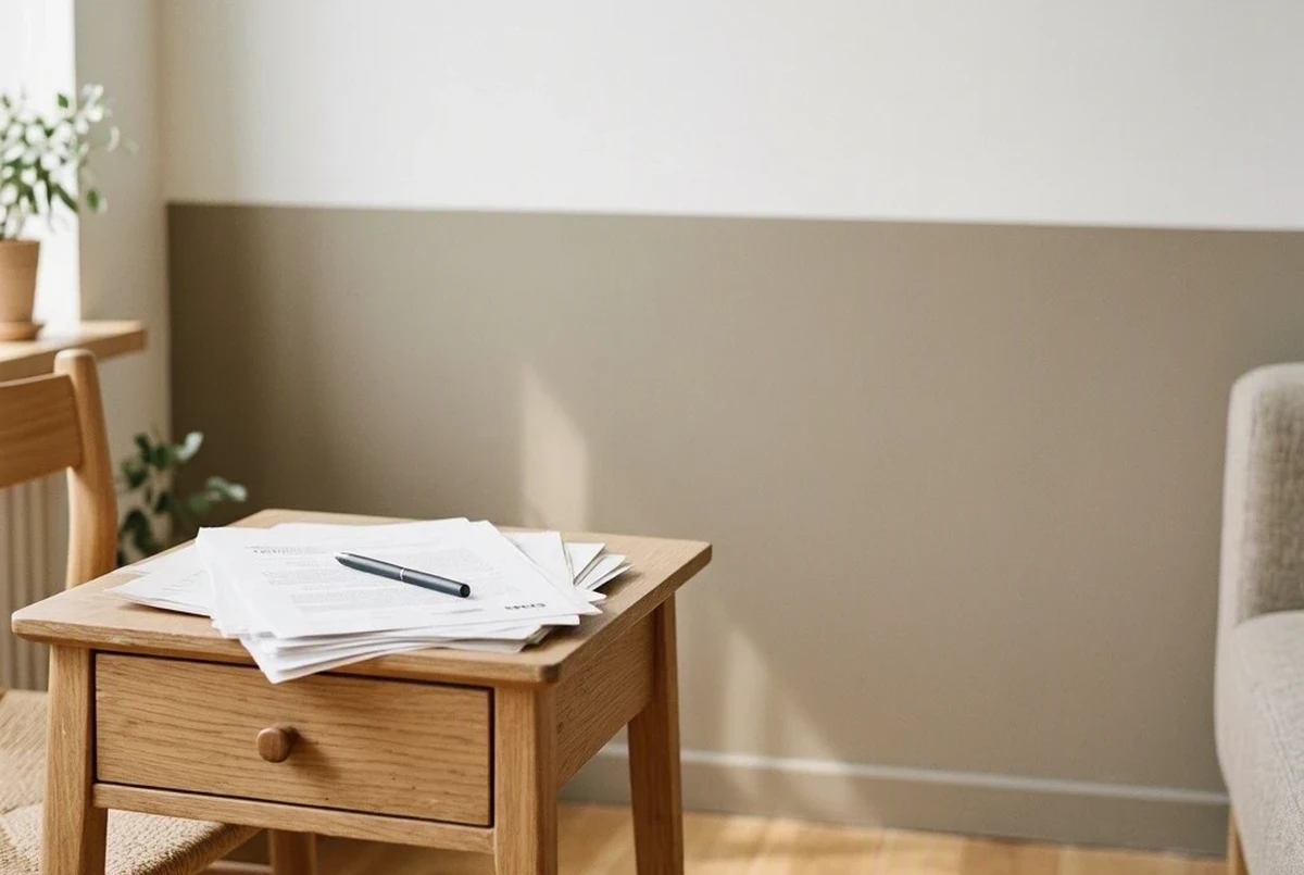
Most leases require written permission before any painting, not a verbal yes from the landlord. Get the colors named specifically, and settle in advance whether you repaint to the original color at move-out or the landlord accepts a neutral repaint instead.
Neutral, professional-looking two-tone combinations get approved far more often than saturated or dark ones. I've watched a landlord flatly refuse Hunter Green on a full wall, then say yes within a day to Revere Pewter on the lower third, because it's cheap and easy to cover if the next tenant wants something else.
Sloppy work counts as damage even when the color itself was approved. Bleeding tape lines, drips, or mismatched sheen between coats can trigger a repaint deduction the same way an unauthorized color would. The HUD tenant rights overview is worth reading before any of this, since deposit deduction rules vary by state and most disputes come down to what was actually agreed to in writing.
If your landlord says no to painting at all, peel-and-stick wallpaper panels or two-tone furniture, like a painted headboard or bookcase, get a similar visual effect without touching the walls. The wall decorating guide for rentals covers the full range of these options.
Mistakes that make a pairing fall apart
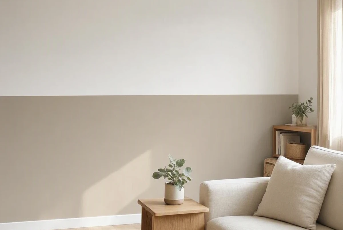
Ignoring undertones. A yellow-leaning white next to a cool blue-gray reads as a mistake even when both colors are attractive alone. Check the undertone before anything else.
Two mid-tone colors with no quiet neutral. Pairing two colors of similar strength everywhere makes a small room visually loud. One of the two needs to recede.
Overdoing contrast across the whole apartment. Strong contrast works on one wall or one zone. Repeated across every room, it makes a small space feel busier and lower the perceived ceiling.
Dark on top instead of bottom. This is the single most common placement error. Dark color above eye level presses the ceiling down instead of lifting it.
Skipping the flooring check. A gray that looks neutral against a white wall in a paint aisle can turn distinctly cool or warm once it's beside your actual wood floor.
Trusting a tiny paint chip. Chips are for narrowing ten options to three, not for making a final call. Test the real thing on the real wall.
Painting every wall a different color. One main color plus one secondary tone, repeated with intention, holds together. A different color per wall or per zone breaks the flow the whole apartment needs.
FAQs
What colors work best for two-tone paint in a small apartment?
Light neutrals paired with a slightly deeper tone from the same undertone family. Chantilly Lace with Revere Pewter, or White Dove with a warm greige, are dependable starting points because neither color fights the other.
Should the darker color go on top or bottom?
Bottom, in almost every small room. The darker tone anchors the space while the lighter color above keeps the ceiling feeling tall. Verify on the actual wall first, since real light can shift how a pairing reads.
Do I need real paint samples, or are paint chips enough?
Paint chips narrow the field but are too small to show how a color shifts with the room's actual light and finishes. An 8 oz Benjamin Moore sample or a peel-and-stick swatch on the real wall shows what a chip can't.
How many sample colors should I test before choosing?
Three to five in the same undertone family, checked at morning, afternoon, and evening light on the actual wall. Fewer risks missing a better match, more just slows things down.
How much paint do I actually need for a two-tone accent wall?
One gallon covers a standard accent wall, since paint runs roughly 350 to 400 square feet per gallon and most single walls fall well under that. A lower-third treatment across a room may need only a quart, but a gallon leaves room for touch-ups.
Will two-tone paint make my small apartment feel smaller?
Not if the two colors share undertones and the darker one stays low on the wall. The room shrinks visually only when the palette clashes or heavy contrast covers every wall instead of one zone.
Can I test two-tone paint colors without losing my rental deposit?
Yes. Peel-and-stick swatches move between walls with zero damage, which is exactly how to test a pairing before asking a landlord for painting permission. Get that permission in writing before any actual paint goes on the wall.
Related Articles
- Two Tone Wall Paint Ideas for Small Apartments: exact split heights by ceiling height and the full mechanics of where to place the color line
- Two-Tone Accent Wall Ideas for Small Bedrooms: the same technique adapted specifically for a headboard wall
- Warm Bedroom Paint Colors for Small Rooms: specific warm-toned single-color picks with LRV targets
- How to Decorate Walls in a Rental Without Damage: deposit-safe alternatives when painting isn't allowed at all