
Two Tone Wall Paint Ideas for Small Apartments
How to split a wall into two colors in a small apartment, with specific line heights for every ceiling height, paint color pairings with codes, renter alternatives, and the mistakes that make rooms feel smaller instead of bigger.

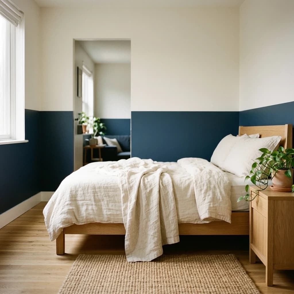
Two colors on a wall. One line. The room feels taller, more finished, and like someone made a deliberate decision.
That is what two-tone painting does in a small apartment when the line is in the right place. This guide covers where that line goes, which colors to use, and what to do if your lease makes painting complicated.
Jump to:
- Why it works in small spaces
- Where to put the dividing line
- Color combinations with specific paint codes
- Five two-tone techniques
- Renter options: paint, peel-and-stick, and tape
- Mistakes that make rooms feel smaller
- FAQs
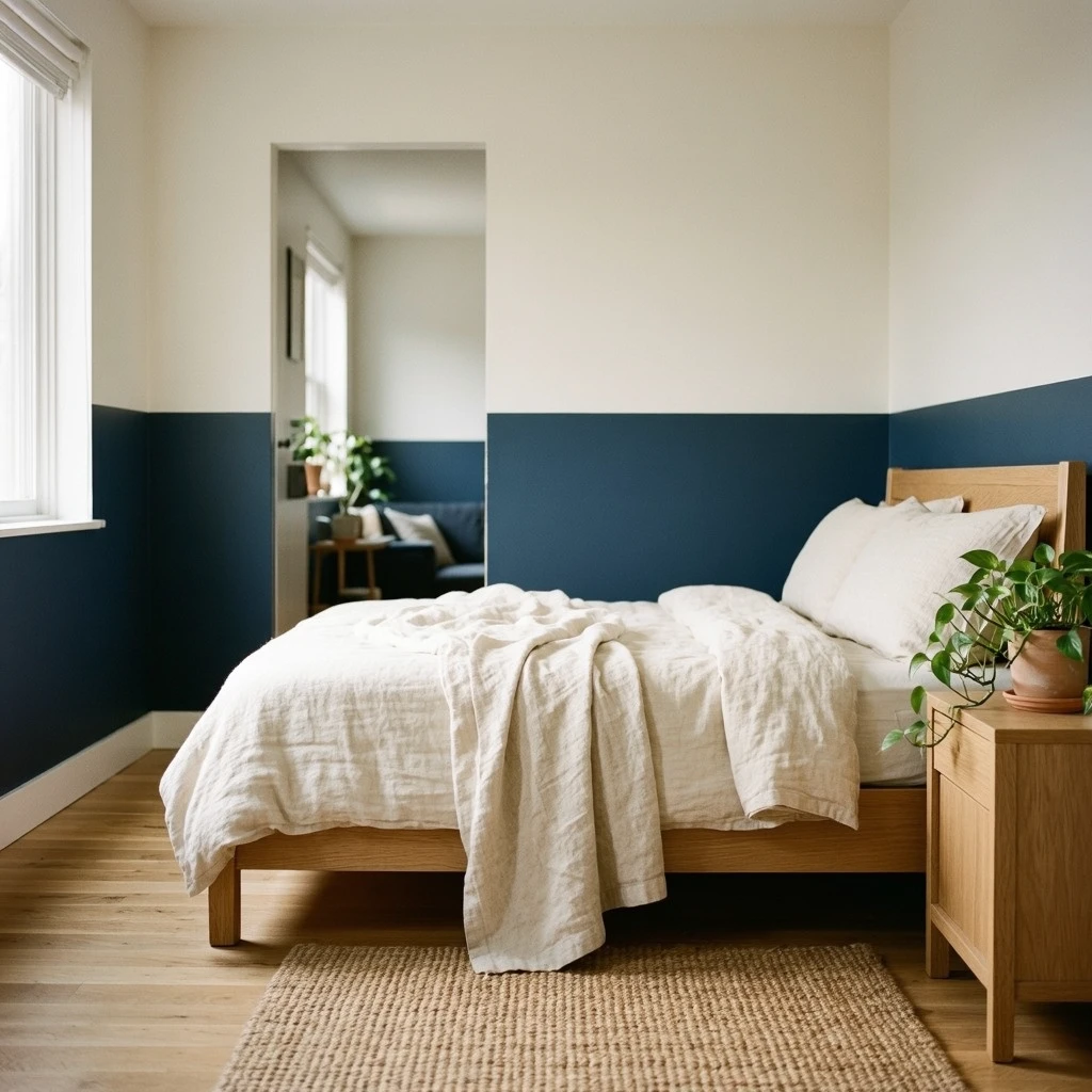
The reason two-tone walls work in small apartments is specific: the eye reads the lighter upper zone as air, the darker lower zone as ground. That distinction makes a flat box feel like it has layers.
Why it works in small spaces
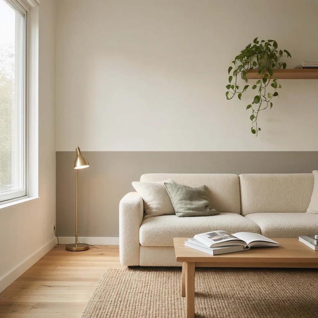
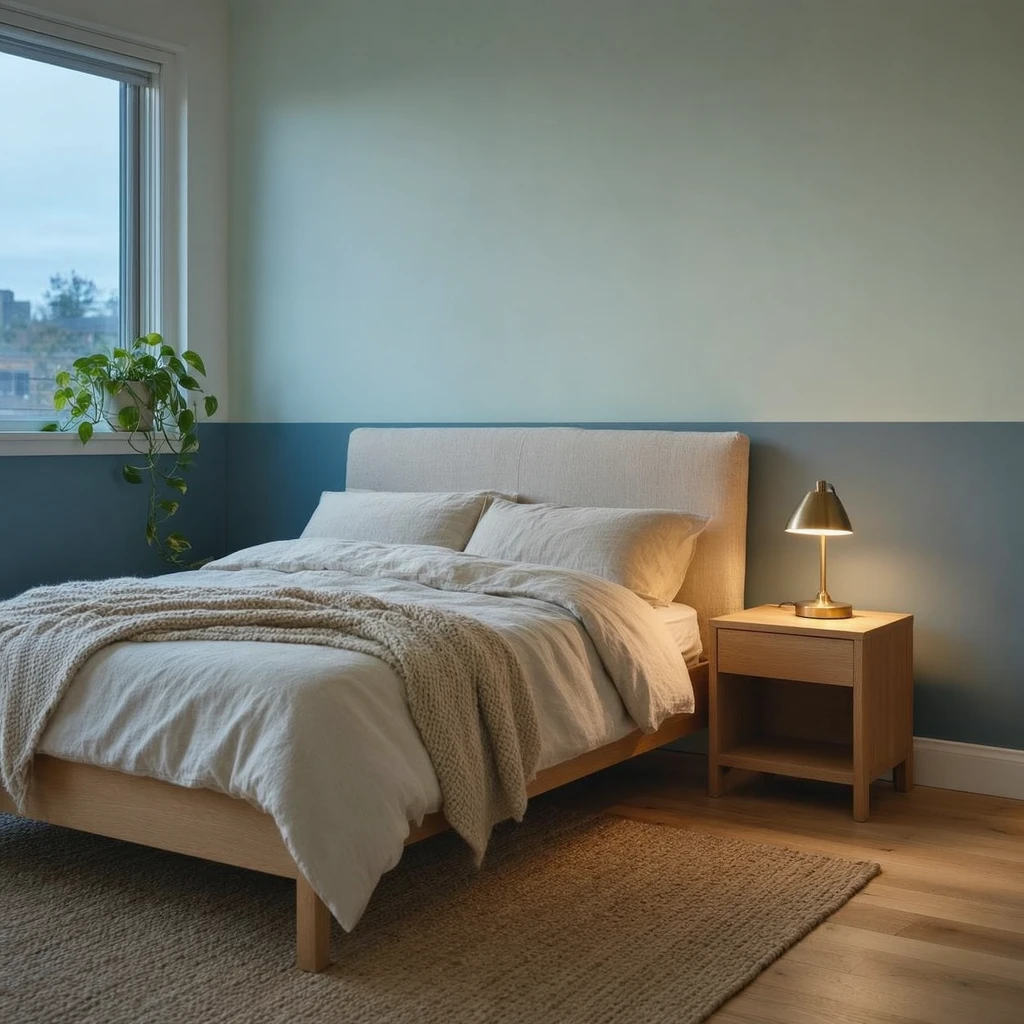
Darker tones visually recede. Lighter tones advance. When you put darker paint on the lower third of a wall and lighter paint above it, the lower section appears to step back while the upper section reads as more open. The ceiling looks higher than it is because the lightest part of the room is closest to it.
This is not just visual theory. It works in practice because of how furniture reads against the wall. A sofa, bed, or bookshelf anchors itself against the darker lower band and looks more deliberate than it does floating against a blank white wall.
Two-tone paint also does something that no rug or curtain can: it defines zones. A different color on the wall behind a desk or beside the bed turns that corner into a distinct area without building anything. In studio apartments, this matters.
The approach is more flexible for renters than it appears. You do not need to paint every wall. One two-tone wall or one accent section changes how the whole room reads.
Where to put the dividing line
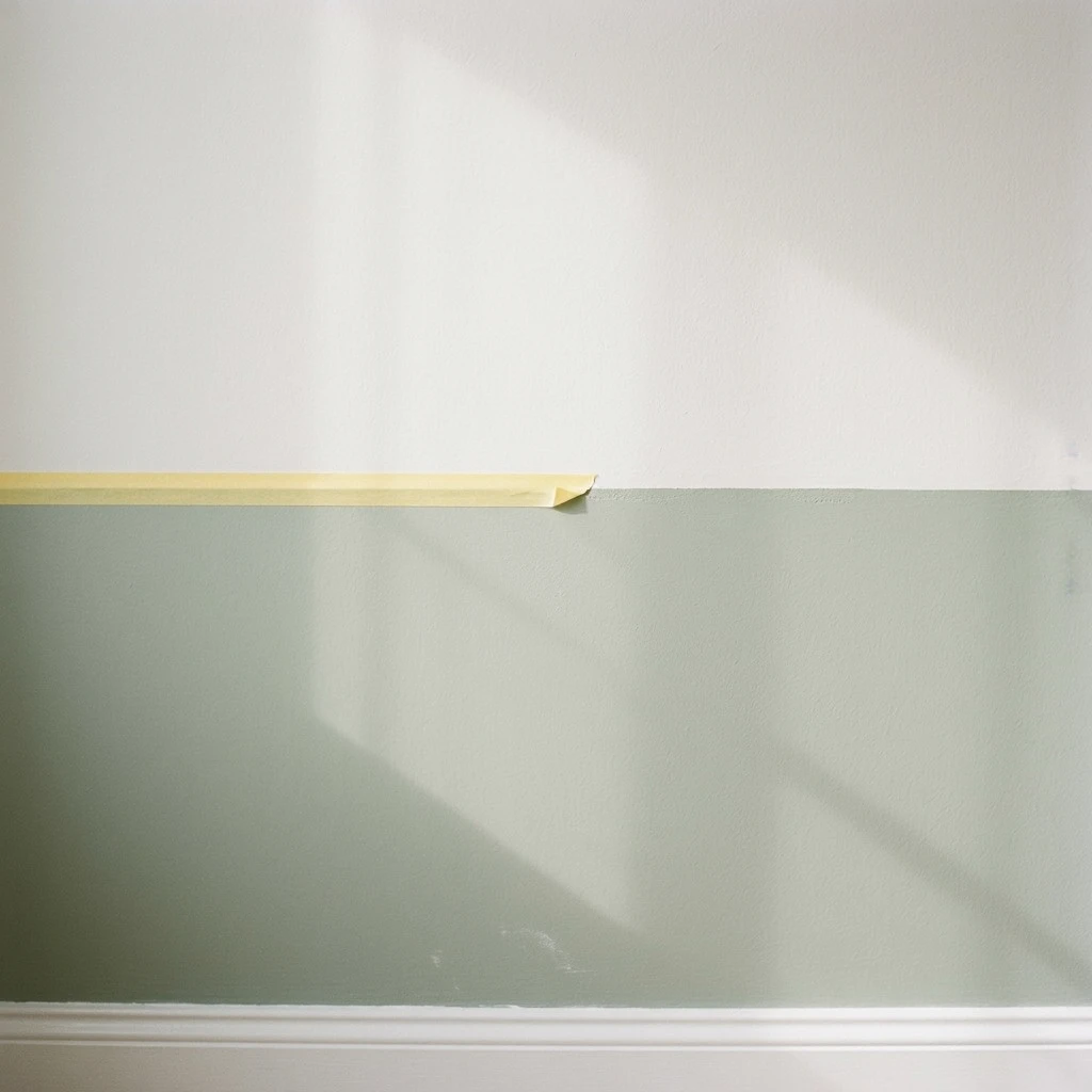
The line height is the decision that determines whether the room feels taller or shorter.
The traditional chair rail sits at 32 to 36 inches from the floor. That number comes from furniture scale: it aligns with the back of a dining chair and the bottom of most sofa backs, which makes the horizontal split look like it was meant to be there. For most 8-foot ceilings, 32 to 40 inches is the working range for the split.
Going higher than 40 inches on an 8-foot wall starts cutting the wall closer to half, which can make the room feel chopped across the middle rather than grounded. Going lower than 28 inches produces a band so narrow it reads as a baseboard accent rather than a two-tone design.
By ceiling height:
- 8-foot ceiling (96 inches): 32-40 inches from the floor. The classic chair rail at 32-36 inches is reliable; 40 inches works for rooms with furniture that sits tall.
- 9-foot ceiling (108 inches): 40-48 inches. More wall to work with, so the line can travel higher without chopping the room in half.
- 10-foot ceiling (120 inches): 48-54 inches. The extra height lets you run a bigger lower section and still have a generous airy upper zone.
Align the line with something in the room if possible: the top of a headboard, a window sill, the shoulder height of a console behind the sofa. A split that relates to the architecture looks designed. A split at a random height looks accidental.
Color combinations with specific paint codes
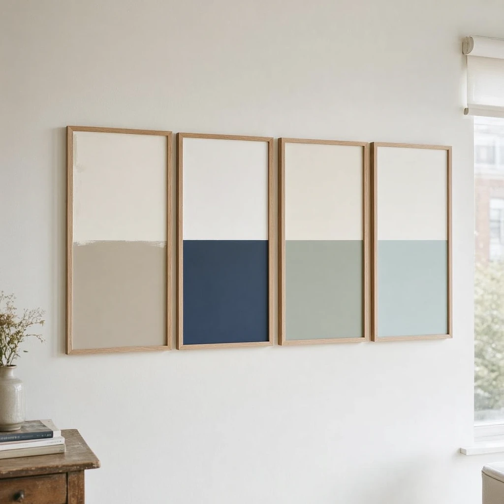
The most reliable approach: pick colors that share undertones. Warm with warm, cool with cool. High contrast between undertones (a warm cream below and a cool blue-gray above) tends to make small rooms feel cut up rather than cohesive.
Five specific pairings that work in small apartments:
1. The dependable neutral (works in most light)
- Lower half: Benjamin Moore Revere Pewter HC-172 (warm greige, light enough to not darken the room)
- Upper half: Benjamin Moore Chantilly Lace OC-65 (crisp warm white)
- This pairing appears in hundreds of small-space makeovers for a reason. Both colors share warm undertones and the contrast is soft rather than graphic.
2. The deep color for good-light rooms
- Lower half: Sherwin-Williams Naval SW 6244 (deep navy)
- Upper half: Benjamin Moore Chantilly Lace OC-65 or SW Pure White SW 7005
- Navy on the lower half reads as intentional rather than heavy when paired with a bright white above. Limit it to one wall in a small apartment.
3. The soft nature pairing
- Lower half: Sherwin-Williams Evergreen Fog SW 9130 (muted sage green-gray)
- Upper half: Benjamin Moore White Dove OC-17 (warm off-white)
- Both colors are low-saturation and read as a cohesive environment rather than a sharp split. Works in bedrooms and living rooms.
4. The pastel contrast
- Lower half: Benjamin Moore Deep Ocean 2058-30 (rich blue)
- Upper half: Benjamin Moore Pale Sea Mist 2147-50 (soft airy greenish white)
- The two colors share cool undertones. The upper Pale Sea Mist is light enough to keep the room feeling open while the lower Deep Ocean adds real presence.
5. The high-drama option for bright rooms only
- One full wall or lower half: Sherwin-Williams Tricorn Black SW 6258
- Remaining walls and ceiling: SW Pure White or any bright white
- Jean Liu, designer, recommends painting walls, ceiling, and trim all in a deep dark like Tricorn Black in small rooms specifically because consistent dark color with no visual breaks can make the room feel taller and larger. This only works with good natural light or strong artificial lighting. In a dark apartment it produces the opposite effect.
For dark apartments with limited natural light, stick to pairings 1 or 3. Pair 5 and navy below work in rooms that get real sun.
The warm minimalist interior design guide covers the broader palette approach for small apartments: how to pick colors that stay cohesive across multiple walls and rooms, not just a single split wall.
Five two-tone techniques
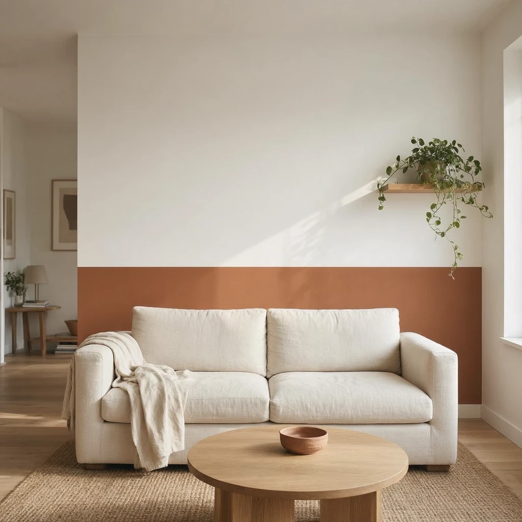
1. Classic horizontal split (lower third dark, upper two-thirds light) This is the most common version and the most forgiving. Dark on the bottom 32-36 inches, light above. Works on any wall in any room. The lower band anchors furniture and hides scuffs; the upper section keeps light bouncing around the room.
2. Half-wall 50/50 split The line sits at roughly 48 inches on an 8-foot wall, the midpoint. This gives the room more architectural weight and reads almost like painted wainscoting without any trim. Works best in dining areas and bedrooms where you want a cozier feel. Avoid this in very narrow rooms (under 10 feet wide) as it can make the space feel more constrained.
3. Vertical color blocking Instead of a horizontal line, divide the wall vertically. One third of the wall in a darker or accent color, the rest in a lighter neutral. This widens the perceived wall without changing ceiling height. Use it behind furniture where it visually frames the piece: a desk, a bed headboard, a sofa.
4. Corner accent Take one corner of a room and paint the two walls meeting at that corner in a different color, running full height. The rest of the room stays in the main color. This creates depth and a clear focal zone without committing to a graphic split across the main wall. In a studio apartment, the corner behind the bed becomes a soft bedroom zone.
5. Soft ombré No hard line. The two colors blend into each other over a 24-36 inch transition band centered around 32-40 inches from the floor. The technique hides wall imperfections and produces a custom look without carpentry. In a bedroom, a gradient from a warm clay below to a soft white above can feel like natural light rather than a design choice, which works well in small spaces.
Renter options: paint, peel-and-stick, and tape
Two-tone painting in a rental requires written permission from your landlord. Not just a verbal yes. Get it by email or in a lease addendum that specifies the colors and whether you will need to repaint to the original color at move-out. Some landlords will approve neutral two-tone combinations (greige below, white above) while refusing dark or bold colors, which is a reasonable middle ground.
If you repaint without permission, the landlord can charge you the full cost of repainting back to the original color at move-out, which in a small apartment typically runs $300-800 depending on paint quality and labor rates.
If painting is not allowed or you don't want the repaint responsibility:
Peel-and-stick wallpaper panels are the most convincing substitute. Apply a panel in a darker color on the lower portion of the wall, leave the existing wall paint above. RoomMates and NuWallpaper both make large-format peel-and-stick panels. The key is to apply them to a clean, properly primed, lightly textured wall. Very smooth walls (typical in newer apartments) work best. Test a small corner first. Remove by pulling down slowly at 45 degrees.
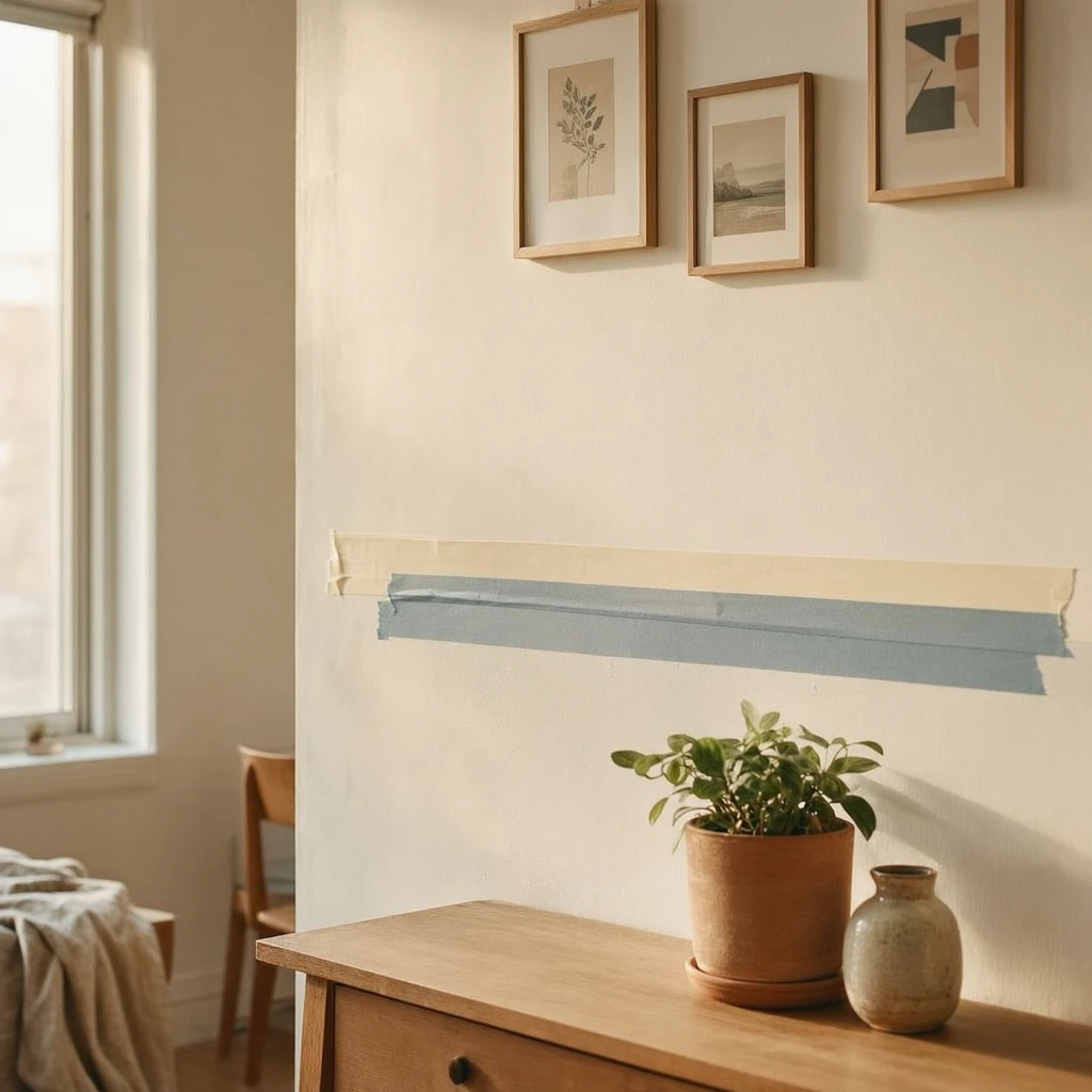
Wide washi tape or decorator's tape works for a graphic split line effect on an existing wall. Use tape that is at least 1 inch wide in a darker tone. This creates a visible horizontal band rather than a full two-color zone, but the effect reads clearly as a deliberate design decision. Tape lifts without residue when removed correctly and costs about $8-15 per roll.
Peel-and-stick backsplash panels in a textured or slightly different color for the lower section can work in kitchens and bathrooms where you want the two-tone effect in a high-visibility area without painting.
None of these substitutes are as convincing as real paint up close. But from a normal viewing distance in a small room, they read clearly as a two-tone design and leave zero trace on the wall.
For more deposit-safe wall techniques, the wall decorating guide for rentals covers the full range of options from Command strips to removable wallpaper.
Mistakes that make rooms feel smaller
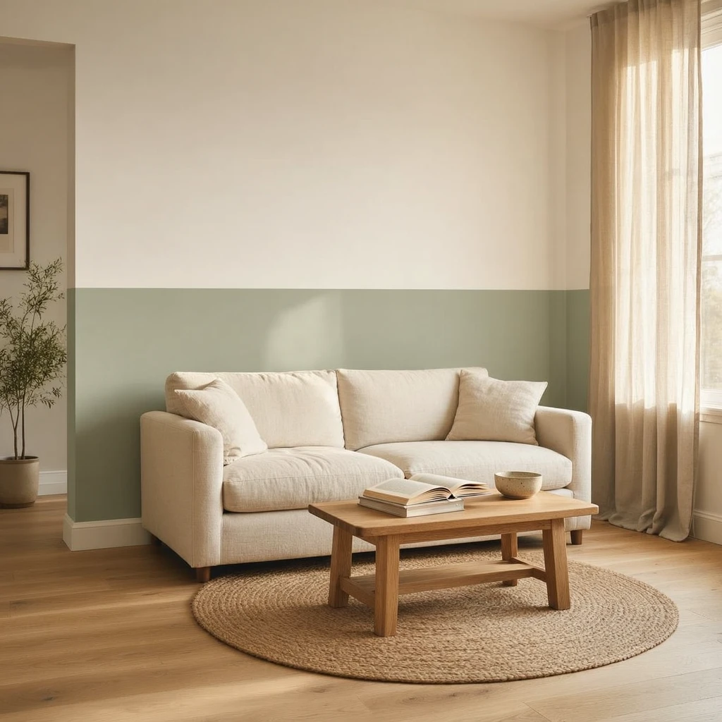
Wrong line height. In low-ceiling apartments (8 feet), putting the darker color too high (say, at 60-70 inches) traps the lighter zone in a narrow band at the top and makes the room feel pressed down from above. Keep the lower dark section to roughly the bottom third in 8-foot ceiling rooms.
Clashing undertones. A warm cream below and a cool blue-gray above look like two separate decisions rather than one cohesive design. The room feels choppy. Fix: check that both colors pull from the same family, both warm (yellow, orange, red undertones) or both cool (blue, green, gray undertones).
Dark on top in a dim room. Dark on the upper half absorbs whatever light the room has and visually lowers the ceiling. In apartments with poor natural light, dark paint belongs exclusively on the lower portion or on a single accent wall with white everywhere else.
Ignoring the split line position relative to furniture. A split line that lands in the middle of a headboard, 3 inches above a sofa back, or at an arbitrary height with no relationship to anything in the room looks unintentional. Align the line with something: the top of the headboard, the window sill, the shoulder height of a console.
Sloppy tape work. Wavy or bleeding lines are more noticeable in small rooms because there is less to distract from them. Use good painter's tape, press the edge down firmly with a credit card or putty knife, then seal the tape edge with a thin coat of the lower color before applying the upper color. This fills any tiny gaps so the second coat cannot bleed underneath. Remove tape while the top coat is still slightly damp, pulling at a 45-degree angle.
Wrong finish on the lower half. Flat paint below the chair rail height gets scuffed in high-traffic areas and cannot be wiped clean. Use eggshell or satin on the lower section. Matte on the upper half is fine; it reduces glare and is forgiving of imperfections.
Two-tone on every wall. In a small apartment, graphic color splits on three or four walls compete with each other and make the room feel visually noisy. Pick one wall or one zone. Let the rest recede.
FAQs
Should the darker color go on top or bottom in a small apartment?
Darker on the bottom, lighter on top. Darker tones visually recede, anchoring furniture and making the lower portion feel grounded. Lighter colors above eye level pull the eye upward, making ceilings feel higher. Dark on top lowers perceived ceiling height and works only in rooms with strong natural light and 9+ foot ceilings.
How high should the two-tone line be in a small apartment?
For an 8-foot ceiling, 32-40 inches from the floor. The traditional chair rail sits at 32-36 inches, a reliable starting point. For 9-foot ceilings, 40-48 inches. For 10-foot ceilings, 48-54 inches. Going higher than these ranges makes the lighter upper section too narrow to read as airy.
Do dark colors make small apartments feel smaller?
Not always. Dark colors recede visually, which can make walls appear further away and the room larger. Designers like Jean Liu use Sherwin-Williams Tricorn Black on all surfaces in small rooms specifically for this effect. The issue is dark on top in dim apartments. That lowers the perceived ceiling. Dark on the lower half with light above is reliable in most small spaces.
Can I do two-tone walls in a rental apartment?
You can, with written permission from your landlord. Get it by email or lease addendum specifying the colors and whether you need to repaint back to neutral at move-out. If painting is not possible, peel-and-stick wallpaper panels or wide washi tape strips give a similar two-tone look without touching the original paint.
What are the best two-tone paint colors for a small dark apartment?
For a dim apartment with limited light, use BM Chantilly Lace OC-65 or SW Pure White SW 7005 on the upper half. On the lower half, BM Revere Pewter HC-172 (warm greige) or SW Evergreen Fog SW 9130 (muted sage) add depth without darkening the room further. Avoid high-contrast pairings like navy below and white above in very dim rooms. The navy absorbs too much of the available light.
What paint finish should I use for two-tone walls?
Eggshell or matte on the upper half to reduce glare. Eggshell or satin on the lower half, since it handles scuffs in high-traffic areas and wipes clean. Avoid flat paint below chair rail height; it marks easily and cannot be cleaned without damaging the surface.
How do I get a clean line between the two colors?
Apply painter's tape at the split line and press the edge down firmly with a putty knife or credit card. Paint the lower color first. Before the upper color goes on, brush a thin coat of the lower color over the tape edge to seal any gaps. Once dry, apply the upper color. Remove the tape while the top coat is still slightly damp, pulling at a 45-degree angle away from the surface.
Related Articles
- Warm Minimalist Interior Design Ideas for Small Apartments: the palette and furniture approach that makes any paint color choice look cohesive across a whole room
- How to Decorate Walls in a Rental Without Damage: the full range of deposit-safe wall options for renters
- Warm Bedroom Paint Colors for Small Rooms: bedroom-specific color direction that pairs well with two-tone techniques
- Renter Friendly Decorating Ideas That Damage Nothing: broader approach to making a rental feel finished without lease risk